
My Usage Data - Self-Service Portal
This article will help you navigate and understand all the features and options available on My Usage Data page on the Customer Self Service Portal
Access Level Required
In order to access this page, you will need to have one of the following roles:
- Work 365 Administrator
- Work365 Subscription Manager
Additional Notes
The information here is only visible to users that belong to an authenticated tenant, meaning that you will only be able to see the usage data for the company you are currently logged in to.
Overview
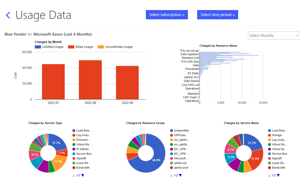
In this Self-Service Portal Data Usage section, you can easily view and track your consumption of Azure services, You can select from a variety of charts that showcase your usage data, including information on resource consumption, and more. Whether you're looking to optimize your usage or simply stay informed, this section provides a comprehensive view of your Azure data usage to help you make informed decisions.
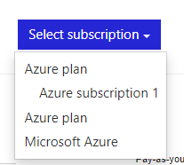
Select subscription
The 'Select a Subscription' dropdown menu allows you to view your Azure usage data for specific billing contracts by selecting a specific subscription from the dropdown, you can see usage data for that subscription only. This is useful for tracking usage for different projects and can help you identify which subscriptions are incurring the most costs.
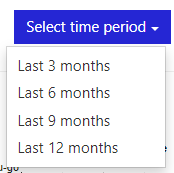
Select time period
The 'Select Time Period' dropdown menu allows you to easily switch between different time periods for your Azure data usage. You can select from options such as 'Last 3 months', 'Last 3 Months', 'Last 9 Months', and 'Last 12 Months'. This allows you to view your usage data in the context of different time periods, making it easy to track changes and identify trends over time.
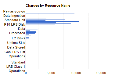
Charges by Resource Name
The 'Charges by Resource Name' report provides a breakdown of your Azure costs, showing the expenses incurred by each individual resource. This report allows you to identify which resources are consuming the most resources and where the majority of your costs are coming from.
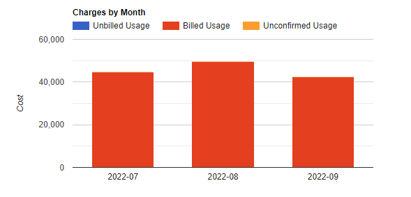
Charges by Month
This chart allows you to track your monthly spending and identify any patterns or trends in your usage. By selecting different months from the dropdown menu, you can also compare your charges across different time periods. This can be useful for budgeting and forecasting, as well as identifying opportunities for cost optimization
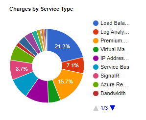
Charges by Service Type
"The 'Charges by Service Type' chart provides a breakdown of your Azure charges by service type. You can see how much you are spending on different Azure services such as virtual machines, storage, databases, and more. This chart allows you to understand where your costs are concentrated and identify which services are consuming the most resources.
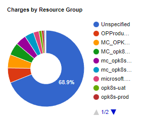
Charges by Resource Group
The 'Charges by Resource Group' graph displays a detailed breakdown of your Azure costs, organized by resource group. This graph allows you to gain insight into which resource groups are consuming the most resources, thus helping you to understand where your costs are concentrated.
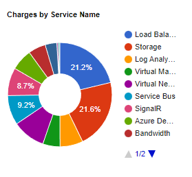
Charges by Service Name
The 'Charges by Service Name' diagram offers a granular breakdown of your Azure expenses, separated by specific service names. This visualization helps you to see which services are consuming the most resources and where the bulk of your costs are being incurred.
Updated about 1 month ago